
I used to roast coffee and sling espresso.
These days I work on digital experiences used by millions of Australians. I love diving into tricky problems, boiling down abstract ideas into a clear direction, and using tech to make things easier.
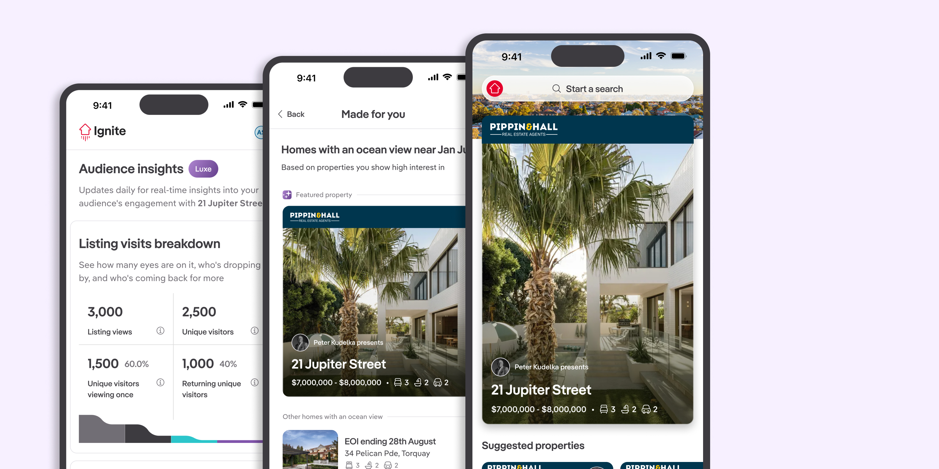
Luxe is a bundle of features aimed at customers moving high value properties. Cumulatively, these features are designed to provide the best possible outcome for the campaign.
It'll match your listing with highly engaged buyers, provide unique audience insights, and even put your listing on the homepage of an app that get's ~10mil unique visits a month (some caveats on that last one 😉).
I can't take credit for final deliverables – my role in this was ideating, shaping and validating the features that would become Luxe. Once the teams we needed help from got involved, I handed over each feature to the relevant designer and was just there to provide guidance so they hit the mark.
And so, what problem does this solve, other than making more money?
We actually have a funny problem where most customers use our current top tier product - making it not very top tier.
Given we only really deliver new value to this tier, it leaves a bunch of lower customers in the lurch. So, adding this new tier is the first step in creating a simpler and fairer product suite.
Giving customers a way to go up a level allows us to retire a now mid-range product, merge a few lower value products and redistribute the value we provide at each tier more evenly.
Tune in later to see if it worked!
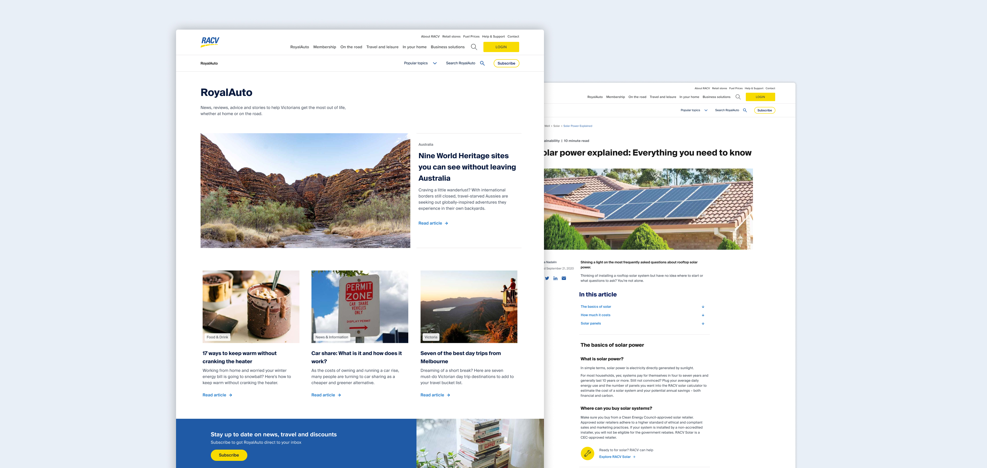
Formerly the largest circulating magazine in Victoria,
RACV's now digital-only Royal Auto was originally designed
to be a magazine, online. It was deliberately different to the
rest of racv.com.au. Fast forward to 2021, this was causing
issues - disjointed digital journeys, difficult navigation,
brand misalignment, and poor ability for cross-linking to the
main site.
A couple rounds of user testing, as well as card sorts to inform
a new IA, led us to a much more stripped back and navigable
design.
Ultimately we wanted to focus on improving the reading
experience, so we went back to type basics. Strong hierarchy,
shorter lines of text, left aligning everything and peeling back
the UI to let the content speak for itself.
And when it came to browsing our users told us they wanted to
see more of whats on offer in one view. Informing new layouts
where we clearly dictate featured content - so as users dive
down, and the amount of content to choose from increases, it
visually becomes more consumable and scanable.
This uplift had some great benefits to the business. Doubling the average time spent on page and increasing average monthly conversions attributed to Royal Auto by 35%.
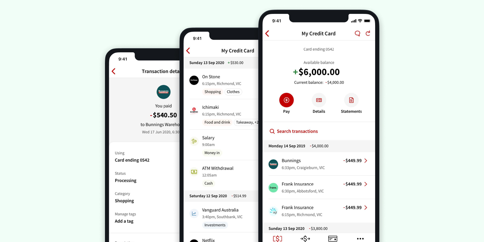
Ever looked at your transactions and had to replay everywhere you've been in the last week?
In Australia people inquire about 14 million unknown transactions every year. So we wanted to elevate our UI to help enable a deeper understanding and traceability of our customer's spending (And bring ourselves up to speed with the neobanks).
To improve transactions at a glance we added an exact timestamp, the location, the name the business is actually trading as, and their logo.
Not only do merchant logos brighten up the interface, but if
customer's aren't seeing transactions labelled
"V3428 17/12 LIM* RIDE COST BARANGAROO 74617630352"
anymore, they're more likely to recognise their own
spending from fraud and be able to report it more accurately.
In order to further ones understanding of their spending we
included a few nice to have's like categorisation and the
ability to create custom tags to track transactions which will
help enable spending insights and other financial literacy
features down the track.
Keen to see a couple other features I worked on at NAB?
Check
out our
in-app Smart Receipts, or
in-app home loan self servicing
for both joint home loans and individuals.
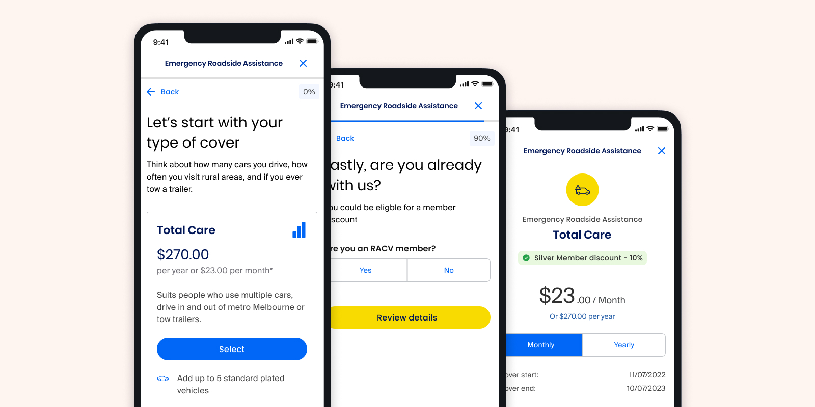
At RACV I mostly work on features and UX enhancements in their quote and purchase flows. These have seen great results, but there was always a feeling refreshing the format and interface from long scrolling forms to quick single question screens could dramatically improve the experience.
So we checked. Multiple rounds of research informed the
conversational, single-minded approach to questioning. Users
stating the process feels simpler and that they're moving
through flows faster – even if amount of questions hadn't
changed. Plus works much better on a mobile device.
This format change from long scrolling screens to single questions also future proofs the flows. Enabling personalisation of forms - with divergent flows or splicing in a couple extra questions needed to take out an additional product without leaving the original process.
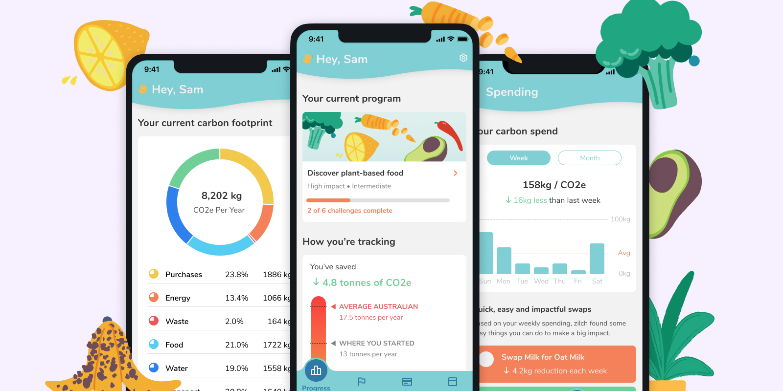
Zilch was a sustainability companion concept I worked on for a large payments provider. It was designed to leverage Open Banking, digital receipting technology and their own API to create a peronalised, mostly automated and data-led understanding of one's carbon output.
These types of apps exist – but there is a huge amount of user effort required to get decent view of your carbon footprint.
So to take the guesswork out of it, Zilch is able to see where, with who and on what you're spending (with your consent of course). And crunch the numbers on your carbon expenditure with extraordinary detail. In turn, suggesting personalised purchasing swaps and challenges to help you reduce your environmental impact.